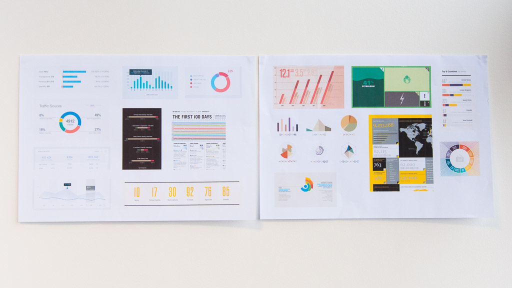
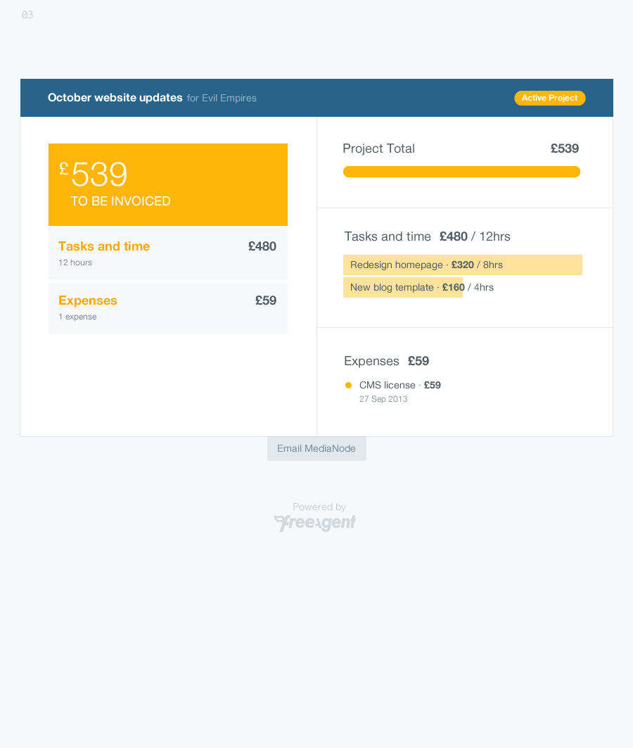
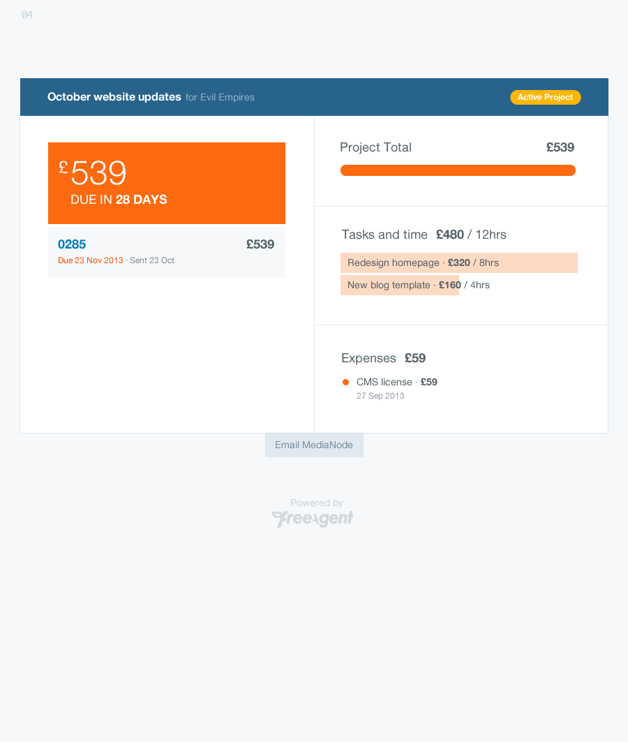
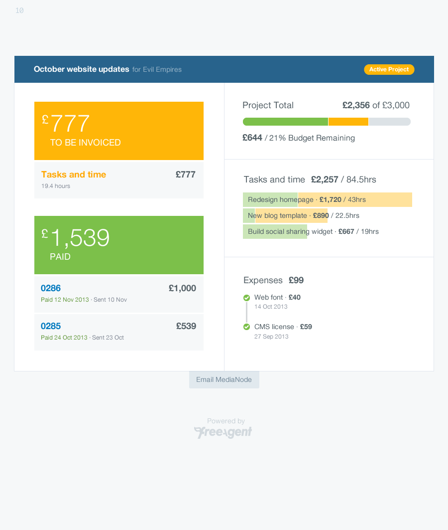
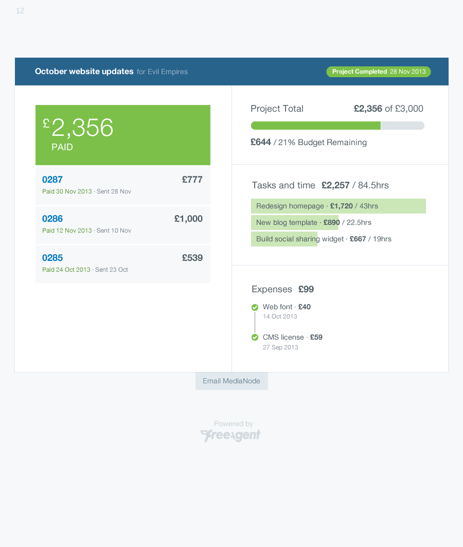
Getting the proof of concept to work in two days left little time for us to expand beyond the design patterns in our existing front-end framework. But one of the project principles was to experiment with the visual language, so I spent several days over the next couple of sprints exploring new ways of displaying the data, trying to make the layout more effective and looking again at colour and type.
Making more of the data
Dashboard data can sometimes feel siloed; the opportunity to communicate relationships and connections between the data is missed. In developing our visual language, I wanted to make sure to connect them.
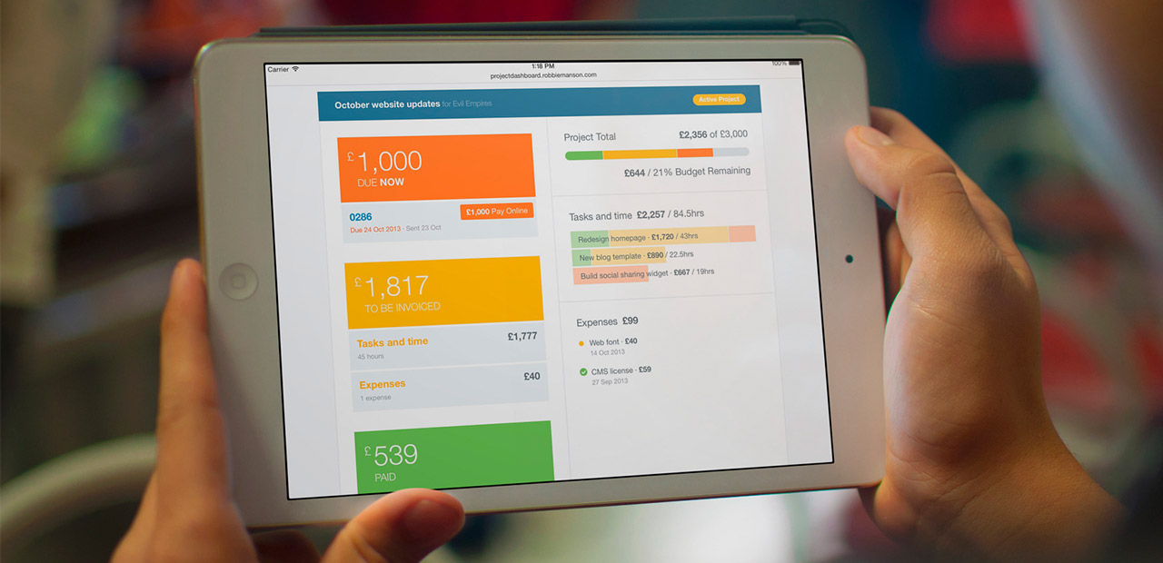
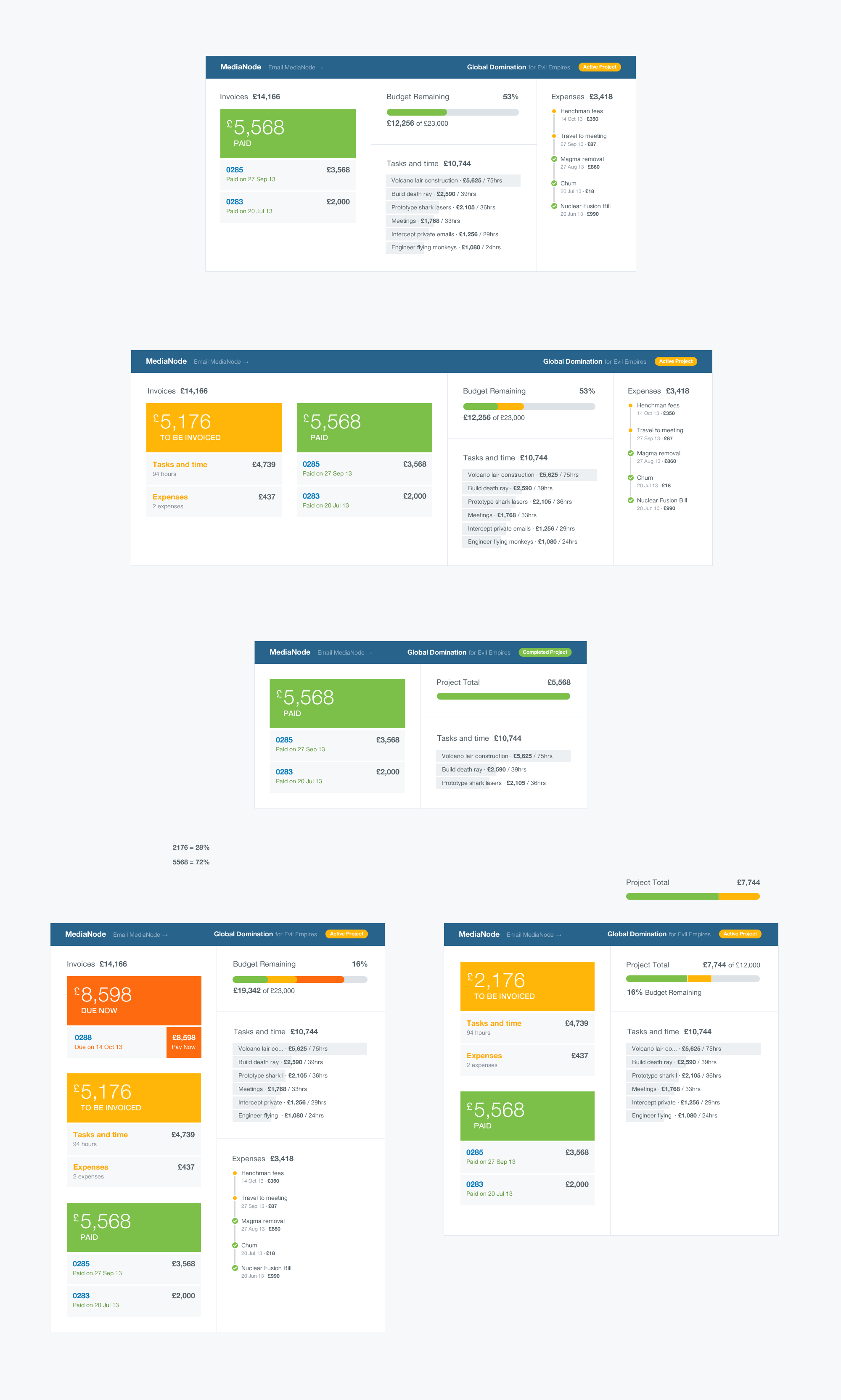
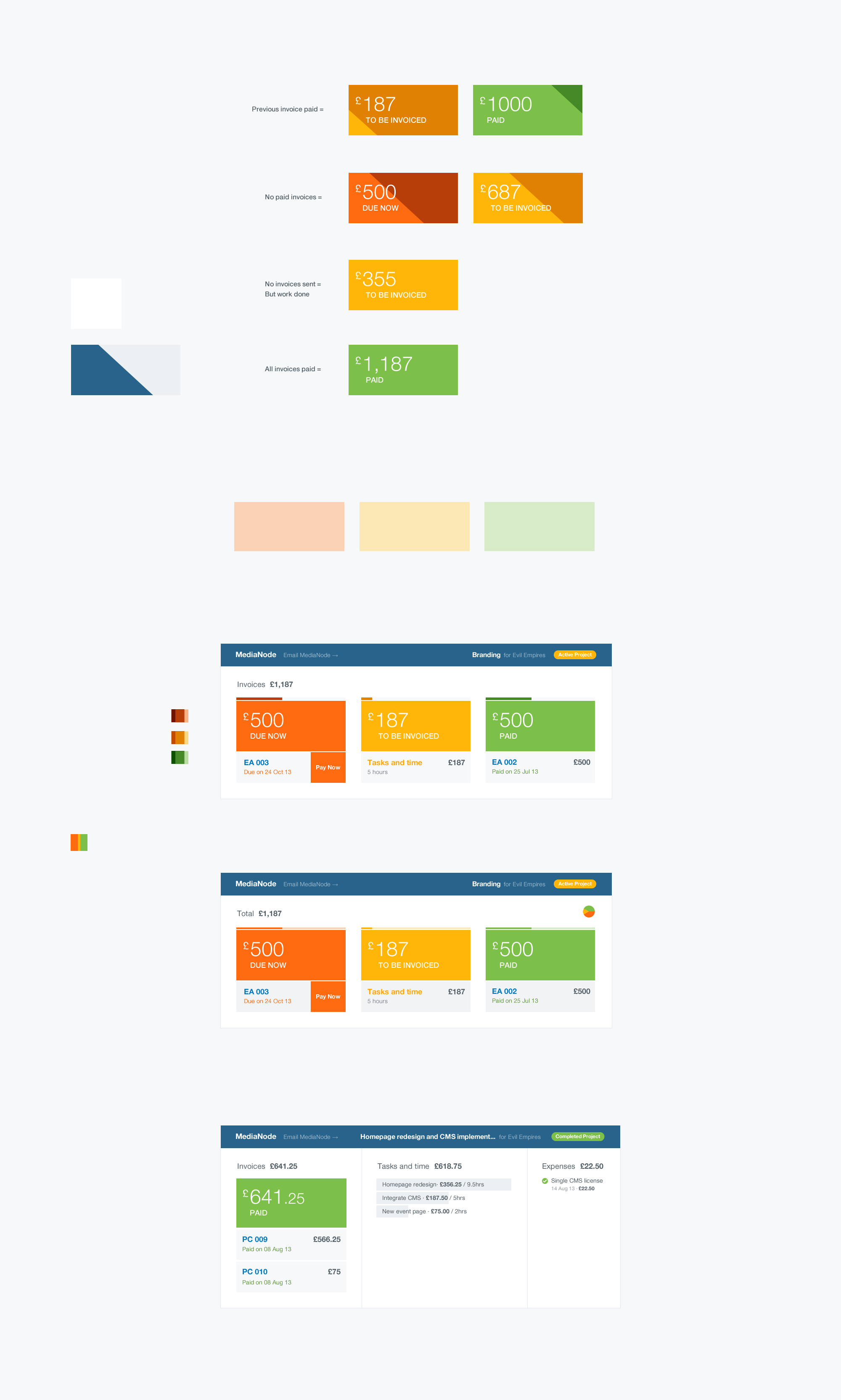
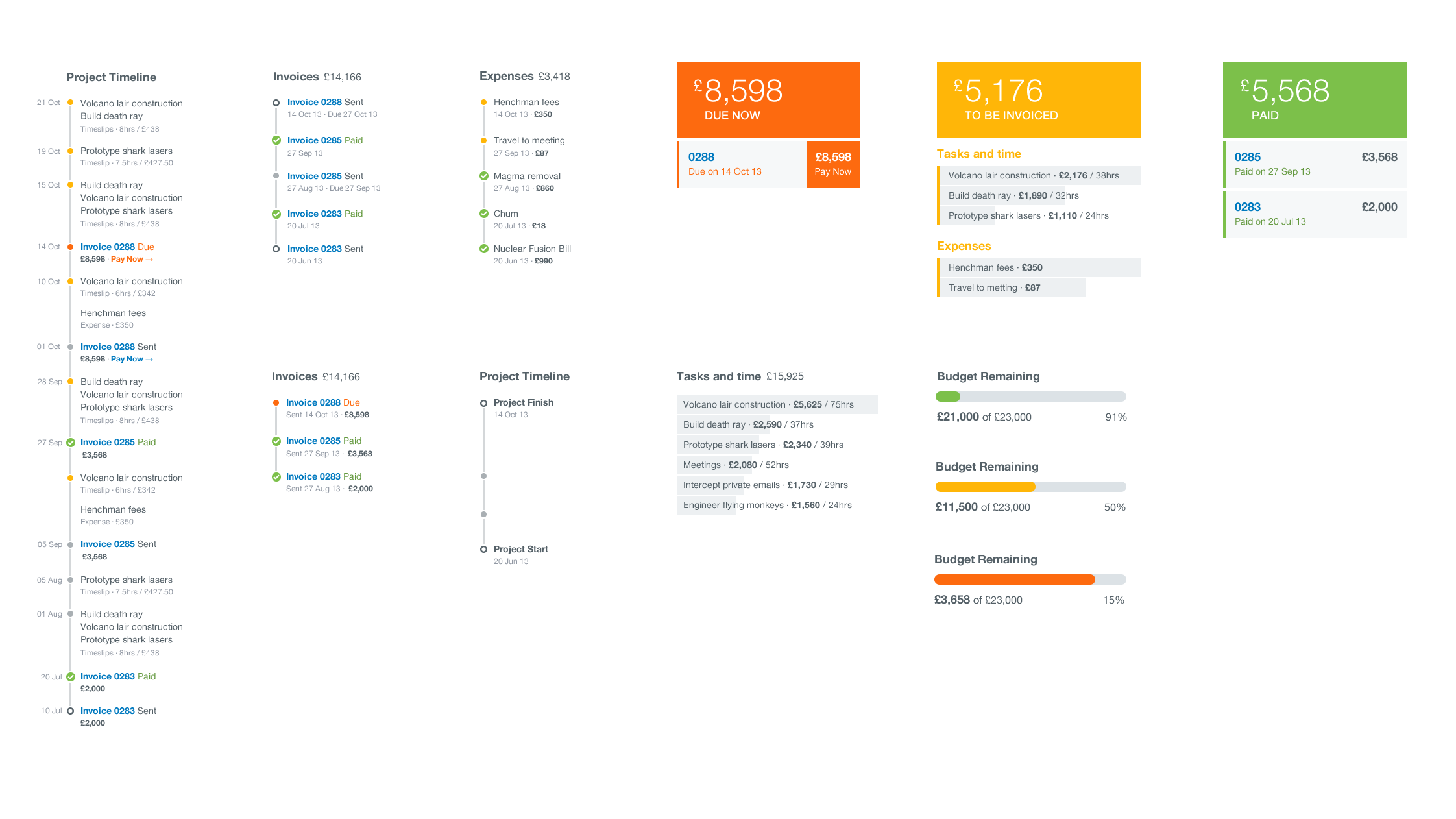
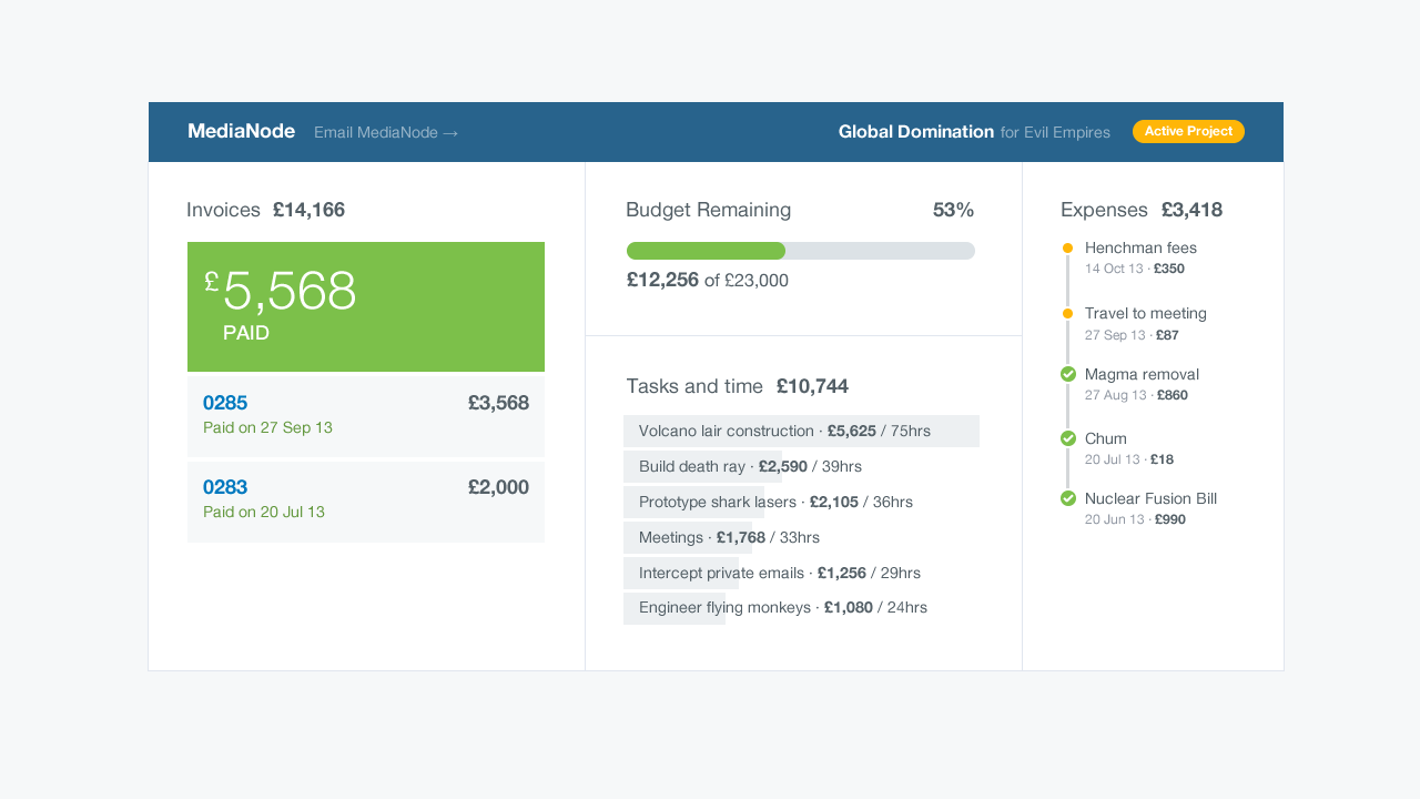
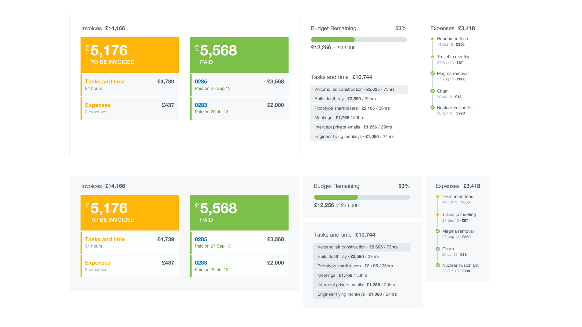
Colour could imply status (‘Paid’, ‘To Be Paid’, ‘Due Now’) and be shared across different sections. Titles could help orient people around the sections, but they could also be used to report the state of their respective data, like the completeness of tasks or remaining budget. Expenses could be grouped relative to a timeline, helping to enhance the project chronology (something I later removed after it caused confusion during testing).
Bespoke yet modular
The trouble with too many dashboards is that hierarchy is sacrificed in the name of modularity, so they lack focus. Form, scale and layout become defined by what looks neat instead of honouring the data.
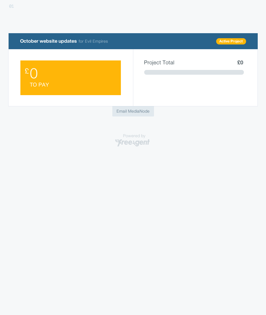
But projects in FreeAgent are extremely variable. They may or may not include: expenses, a budget, timeslips, online payment options, and any combination of paid, to-be-invoiced or due invoices. Despite this, a dashboard should never feel like it’s somehow empty or vacant. It should feel like the data couldn’t have been presented any other way, something anthropologist Carolyn Bloomer calls “optimal closure”.
By looking at production data around projects, I already knew the mean number of invoices, tasks, timeslips, expenses and more, and I knew the outlying figures. These constraints meant I could create a layout that felt bespoke, with big numbers and generous spacing, but didn’t sacrifice modularity. Having an above-average number of invoices, tasks or expenses wouldn’t throw the whole thing off.
