A New Approach (Pt II)
Following on from getting the project proposal and contract signed off during Part I, I’ve procured the content and brand assets so now it’s onto planning and design concepts.
Wait, “procured the content”? That sounded easy! Listen, I know. Planning for, authoring and managing content is hard. We wouldn’t be building entire web apps or writing whole books on it if it was easy. But this project is not an exercise in content strategy; it’s a small, single-page site with a very specific purpose: promoting a bi-annual comedy show. The content consists of:
- Site title and description
- Details of next show (Date/time/venue, booking methods)
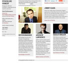
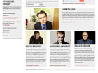
- Name, photo, profile (55 words), testimonial quote and link to YouTube videos for each of the 4 acts
- Mailing list signup form
- Links to Facebook and Twitter accounts, and sharing links
Getting started
Gathering snippets of visual inspiration and marking up the content in HTML have been the first two steps. I find marking up content early a great way to familiarise myself with the subject matter, at the same time as actually getting the work done. The difference this time has been my “mobile first” mindset.
Knowing that, at the most basic level, visitors will experience a single-column layout has helped me better focus on content hierarchy: most important at the top, least important at the bottom. No decisions influenced by a more “designed” layout. Traditional wireframes have always felt too influential in this regard. When beginning design concepts, I’ve often felt trapped by the wireframe layout that the client has already signed off, when in many cases all the wireframe needed to do was define simple hierarchy.
Branding work was completed by a separate company prior to kick-off on the website, with a creative direction intended to be reminiscent of 19th century circuses. I’ve received logo variations and a colour palette, but little more. This has been a bit of a blessing, as I can help shape an appropriate web presence for such a young brand without overbearing print guidelines.
Building a prototype
With the content all marked up in gooey, semantically rich HTML, I’ve defined styling for typographic and basic layout elements in global.css. Choosing 14px as my ideal text size, my measurements for type and imagery are based on the 2:3 ‘Musical Fifth’ ratio, and resulting modular scale. While I’ll be further integrating this scale into the design as the site progresses, I didn’t want to get too caught up in it at this stage, as I had quick and dirty layouts to prototype.
There is no existing Punchline website from which to deduce statistics on visitor resolutions or devices, so I’ve chosen to use the display areas of common devices as breakpoints for my media queries. These media queries, declared in a separate screen.css file, only get served up to devices with a minimum display area of 480px (iPhone in landscape mode). Devices with display areas of less than 480px, like “feature phones” or common smartphones in portrait mode, simply get served up global.css. From there it’s been a case of choosing the most suitable grids for the given content and display area.
Breakpoints and layouts
Note: The acts featured in my prototype and design are not the real acts appearing in the show. They’re simply examples I’ve picked for the purpose of this write-up, to protect the integrity of the real show.
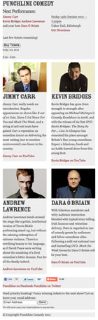
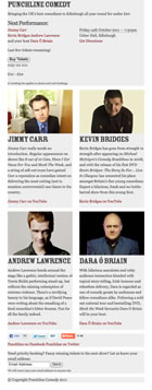
Devices with a display area of up to 479px will see a single-column layout; each content block stacked on top of another. Devices with display areas of between 480px and 599px see a two-column layout; each act assuming a column (with two acts stacked on top of the other two) and the show summary, mailing list signup, social links and footer all spanning the width of both columns. Display areas of between 600px and 767px retain the two-column layout, but receive a couple of extra snippets of content that weren’t absolutely necessary at smaller sizes.
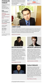
This is where it starts to get a bit more interesting. Display areas of 768px and larger see the header pulled out to the left-hand side, looking more like a sidebar. This element is given position: fixed; to retain it’s position as the document scrolls (it’s kind of important, seeing as it contains the booking information). The mailing list signup and social links are absolutely positioned above the acts to take the place of the header. The headline act assumes the full width of the main content area, with the middle slot and opening act still split into two columns underneath it. The compere appears underneath these two acts, spanning both main columns.
This three-column layout then morphs into a four-column layout for display areas of 1024px or larger, with the compere coming up to join the two other acts in columns underneath the headline act. There is no change for display areas of more than 1200px yet, but I’ll likely progressively increase type sizes to maintain readable measures and eventually set a max-width on the site container.
Because each layout is liquid, all that’s really happening from one breakpoint to another is the addition (or subtraction) of floats, percentage widths and margins. As a result, it’s been super quick to knock up the prototype.
It’s sure as hell not pretty, but take a look. Resize your browser to see the breakpoints in action.
Static visual mockup
I found my base typographic sweet spot in the process of creating the prototype: 14px Georgia with a 1.5em line-height. I also chose Rosewood Std Fill for both h1 and h2 headings, as it made sense historically; Adobe based it on an 1874 design, which fits nicely into our 19th century bracket. But other than basic typography and layouts, I’d done no visual design work at all.
Though the brand assets riffed off old 19th century circus artwork, I was told specifically that the site should have “a hint of circus”. Take from that what you will, but I heard: don’t design a page that’s meant to look as if it’s inside some god-awful circus tent or staring down a lion’s throat, just drop enough hints and people will get it.

I’ve based my static visual mockup on the 1024px-and-up layout, employing an eight-column grid (960px wide). It’s hardly the greatest thing I’ve ever designed, but as a first-pass concept, it feels developed enough to send off for some feedback. I deliberately didn’t work into it too much; it’ll develop in due course.
Why 1024? It’s the easiest reference point for the client. They’re used to browsing websites of around this width on their desktop anyway, and this layout is, I suspect, likely to be the one visitors see most.
I emailed the client a link to the visual mockup set in a browser, accompanied by a video. In both the email and video, I emphasise the fact that this mockup is an “artist’s impression” of what the final site may look like. In the video (a screencast), I simply take a few minutes to explain my reasoning behind the responsive approach and demonstrate the breakpoints in action. This should help the client understand what is otherwise a potentially lofty concept, or at least a relatively new one. Particularly if they’re not a complete nerd.
Potential issues
Getting to this point has been an interesting (and at times downright fun) process, and though it feels like I’m making good progress, I’m left with more questions than answers…
Q: How will I get around loading large inline and background images across potentially weak data connections (not to infer strength of data connection from device resolution, of course)?
A: Only load large background images past certain breakpoints? For inline images, load smaller versions by default and feed large versions to more capable devices with Filament’s script?
Q: Will browsers, like IE6, 7 and 8, that don’t understand media queries simply get served up the basic linear layout?
A: Without JavaScript enabled, yes, though there is the option of using css3-mediaqueries.js to mimic the work media queries are doing. The idea of having an entirely JS-dependant layout does feel wrong to me, but I’m not ruling it out for these cases. Alternatively, simply serve up the 1024+ layout to IE7 and 8, as they would otherwise get were the site not responsive at all. IE6 will likely get a basic, linear layout.
Q: Will lettering.js and fittext.js work well enough, and how will I avoid all this JS load for small screen users who won’t even get to see the results?
A: My plan is to set the complicated type using lettering.js and FitText. I’m a bit apprehensive, as I’ve never properly integrated them into a site build. As for avoiding JS bloat on devices that can’t even make use of it, people much smarter than me allude to the fact that it isn’t easy. So, yay.